VISUAL IDENTITY · ILLUSTRATION · MOTION
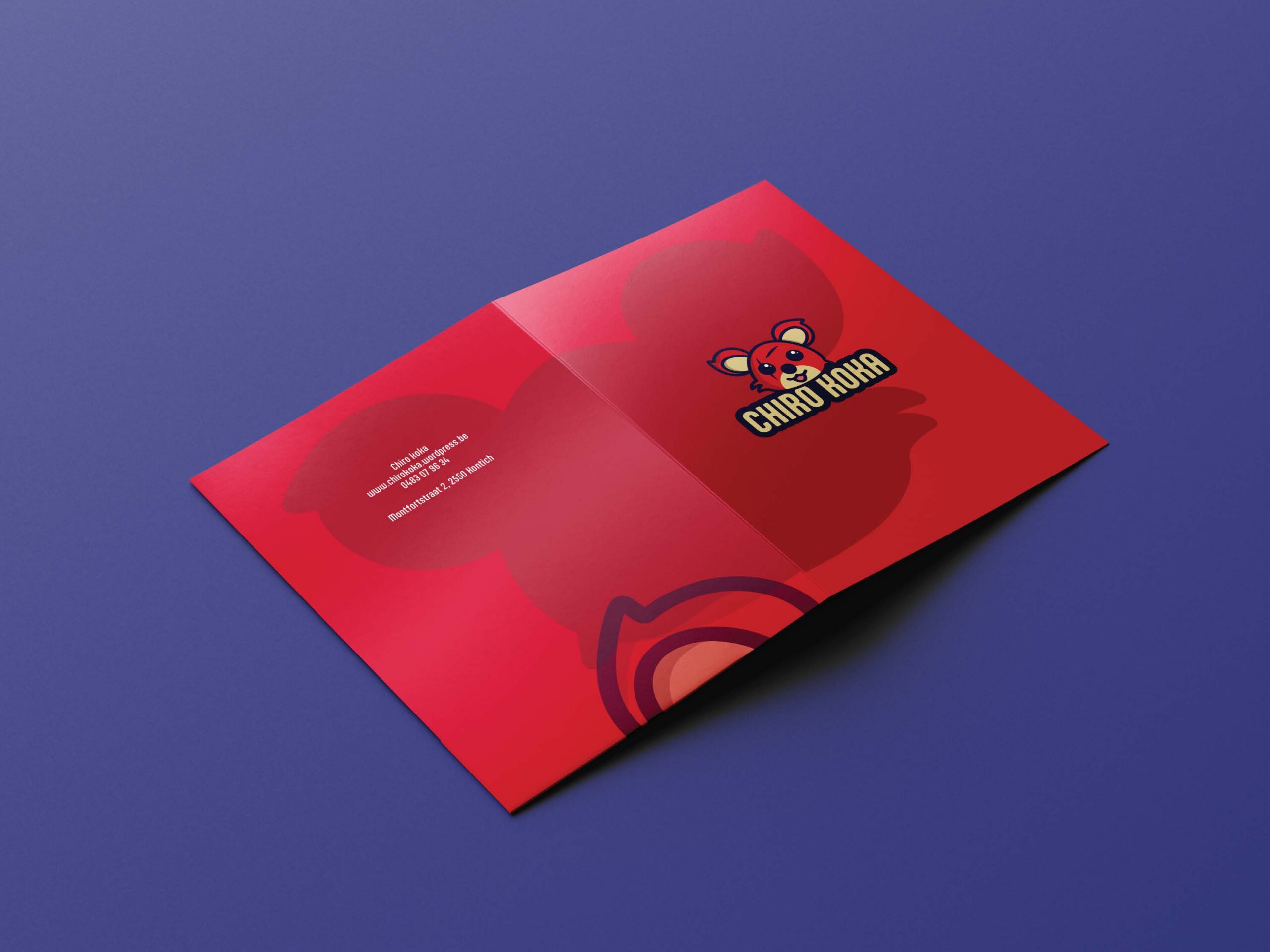
A playful visual identity created for Chiro Koka, combining a recognisable mascot, bold colours and motion into one consistent visual style.
The concept
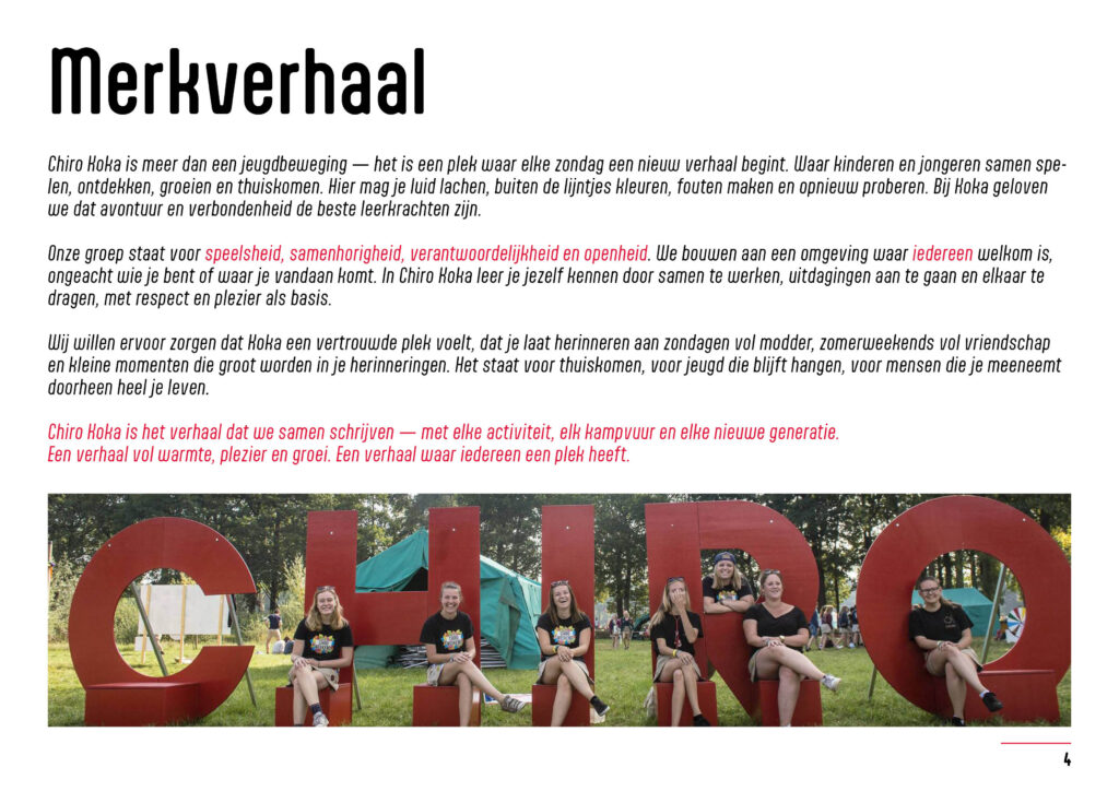
Chiro Koka is a youth movement centred around play, adventure and bringing young people together. The goal was to create a visual identity that reflects this energetic and welcoming atmosphere while remaining clear and recognisable across different applications.
Visual identity
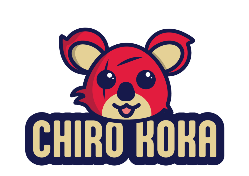
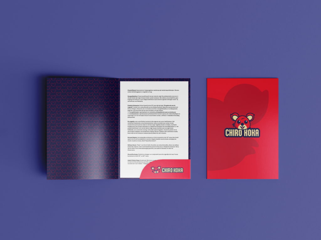
The identity was built around a playful mascot that gives Chiro Koka a recognisable face. Combined with a bold colour palette and strong typography, the visual system creates a youthful and energetic look that can be used consistently across different communication materials.
Tools: After Effects · Illustrator
The mascot
The mascot became one of the key elements of the identity. Its playful character fits the personality of the youth movement and makes the brand more approachable and memorable, especially for a young audience.
Motion
To bring the identity to life, I also developed an animation using elements from the visual system. Motion adds another layer to the identity and shows how the branding can extend beyond static applications into digital content.
Outcome
The final result is a colourful and flexible identity that gives Chiro Koka a stronger and more recognisable visual presence. The combination of logo, mascot, colour and motion creates a consistent system that can be used across both print and digital communication.